SVG 一览
引言
SVG(Scalable Vector Graphics) 应该是浏览器发展历史以来,曲线绘画支持度最高的一块内容了。HTML 提供了定义段落、表格、标题等内容的元素,SVG 提供了用于定义矩形、复杂曲线图形的元素,之后 SVG 也变得复杂起来,渐变、旋转、动画、滤镜等效果,以及和 JS 交互也都慢慢加上了。
SVG 自 2003 年被 W3C 作为推荐标准以来,最接近的完整版本是 1.1 版,在 2011 年 SVG1.1 的第二个版本成为推荐版本,完整的 SVG1.2 本来是下一个标准版本,但是被 SVG 2.0 取代了。针对移动端,SVG 在 2003 年推出了 SVG Tiny 和 SVG Basic,在 2008 年 SVG Tiny1.2 成为 W3C 推荐标准。
入门
SVG 是由 <svg> 标签包裹的一组元素,也可以说是 XML 用来描述图形和绘图程序的语言。简单看一个例子:
<svg
  version="1.1"
  baseProfile="full"
  width="300"
  height="200"
  xmlns="http://www.w3.org/2000/svg"
>
  <rect width="100%" height="100%" fill="rgb(248,113,113)" />
  <circle cx="150" cy="100" r="80" fill="rgb(74,222,128)" />
  <text x="150" y="125" font-size="60" text-anchor="middle" fill="white">
    Dao
  </text>
</svg>
以上就是一个简单的 SVG 文件效果,其中:
- version 表示 SVG 遵循的版本规范,只有
1.0和1.1这两个有效选择。 - baseProfile 表示一个 SVG 的描述,取值为
none|full|basic|tiny。 - width 和 height 表示 SVG 整体容器的宽高。
- xmlns 表示 SVG 遵循的命名空间(作为 XML 语言需要正确命名它)。
在 SVG2 后,不再需要 basePofile 和 version。
在 XML 中,标签和属性属于命名空间,这是为了防止来自不同技术的标签和属性发生冲突。例如在 SVG 中存在 a 标签,在 HTML 中也存在 a 标签,那么怎么区分这个 a 标签属于哪一种技术,这就需要使用命名空间了。 加入命名空间以后我们就能知道哪一个是 svg:a,哪一个又是 html:a,这样我们就可以区分出不同的标签和属性。
文件属性和类型
SVG 中元素的渲染顺序是 “后来居上”,越后面的越可见。在 Web 上渲染 SVG 一般有两种:直接渲染 SVG 文件 和 嵌入到 HTML 中:
application/xhtml类型的文件,可以直接把 SVG 嵌入 XML 里。- 可以通过
<object />、<iframe />、<embed>、<img />、background-image以及行内引入,更多的说明可以查看 W3C 对于SVG 使用的说明。
SVG 文件同样支持压缩,通过 gzip 的方式压缩之后,会生成 .svgz 后缀的压缩文件,当然想要正常访问需要在服务端添加相关 gzip 的配置。对于普通的 SVG 文件,服务端会发送这种请求头:
Content-Type: image/svg+xml
Content-Type: image/svg+xml
而对于压缩的 SVG 文件,则会发送这种:
Content-Type: image/svg+xml
Content-Encoding: gzip
Content-Type: image/svg+xml
Content-Encoding: gzip
坐标系统

和 Canvas 差不多, SVG 使用的坐标左上角是(0, 0),坐标以像素为单位,x 轴正方向是右,y 轴正方向是下。
在 SVG 文档中的 1 个像素对应输出设备的 1 个像素,由于 SVG 是可缩放的,所以它可以对应 绝对单位 或者 相对单位,在 CSS 长度单位 中对 em、px、pt、cm 等有相关介绍。默认情况下 1 个用户单位等于 1 个屏幕单位,但是在使用的时候要标明,SVG 通过 容器 和 绘制区域 来实现:
<!-- 容器的大小为 100x100 -->
<svg width="100" height="100" />
<!-- 容器的大小为 100x100 -->
<svg width="100" height="100" />
定义一个 100x100px 的容器,这时候 1 个用户单位等于 1 个屏幕单位。
<!-- 容器的大小为 100x100,绘制区域为 50x50 -->
<svg width="100" height="100" viewBox="0 0 50 50" />
<!-- 容器的大小为 100x100,绘制区域为 50x50 -->
<svg width="100" height="100" viewBox="0 0 50 50" />
把 50x50 的绘制内容放到 100x100 的容器上展示,这个时候就会放大两倍。
在某些文章描述中,会把容器称之为 视口范围(viewport),把绘制区域称之为 可视区域(viewBox),所以也可以这样做个总结:当 viewBox 小于 viewport 时会放大,当 viewBox 大于 viewport 时会缩小,二者相同时等同于没有 viewBox。
如果你想深入了解坐标系统,可以看下 Sara Soueidan 的 Understanding SVG Coordinate Systems and Transformations,她也有一个非常棒的 在线 Demo 来让你熟悉 SVG 坐标系统。
基本形状
SVG 有 6 种基本形状:矩形(rect)、圆形(circle)、椭圆形(ellipse)、线条(line)、折线(polyline)、多边形(polygon):
<!-- 上图的 svg 示例 -->
  <svg
    version="1.1"
    baseProfile="full"
    width="600" height="300"
    xmlns="http://www.w3.org/2000/svg"
  >
    <rect width="100" height="100" fill="red" />
    <circle
      cx="280" cy="50"r="50"
      fill="green"
    />
    <ellipse
      cx="500" cy="50" rx="70" ry="30"
      fill="blue" stroke-width="5"
     />
    <line
      x1="480" y1="150"
      x2="580" y2="250"
      stroke="yellow" stroke-width="8"
    />
    <polyline
      points="200 180 250 240 300 180 350 240 400 200"
      stroke="orange"
      fill="transparent"
      stroke-width="5"
    />
    <polygon
      points="50 160 55 180 70 180 60 190 65 205
      50 195 35 205 40 190 30 180 45 180"
      fill="cyan"
    />
  </svg>
矩形
<rect
  x="10" y="10"
  rx="10" ry="10"
  width="80" height="80"
  stroke="yellow" stroke-width="8"
  fill="red"
/>

<!--
  x、y:矩形左上角坐标
  rx、ry:四个角的圆方位半径
  width、height:矩形的宽高
  stroke、stroke-width:边框颜色和长度
  fill:内容填充颜色
-->
<rect
  x="10" y="10"
  rx="10" ry="10"
  width="80" height="80"
  stroke="yellow" stroke-width="8"
  fill="red"
/>

<!--
  x、y:矩形左上角坐标
  rx、ry:四个角的圆方位半径
  width、height:矩形的宽高
  stroke、stroke-width:边框颜色和长度
  fill:内容填充颜色
-->
圆形
<circle
  cx="50" cy="50" r="40"
  stroke="green" stroke-width="10"
  fill="yellow"
/>

<!--
  cx、cy:圆心位置
  r:半径
-->
<circle
  cx="50" cy="50" r="40"
  stroke="green" stroke-width="10"
  fill="yellow"
/>

<!--
  cx、cy:圆心位置
  r:半径
-->
椭圆形
<circle
  cx="50" cy="50" r="40"
  stroke="green" stroke-width="5"
  fill="emerald"
/>

<!--
  cx、cy:椭圆心位置
  rx、ry:椭圆的 x 和 y 半径
-->
<circle
  cx="50" cy="50" r="40"
  stroke="green" stroke-width="5"
  fill="emerald"
/>

<!--
  cx、cy:椭圆心位置
  rx、ry:椭圆的 x 和 y 半径
-->
线条
<line
  x1="10" x2="50"
  y1="110" y2="150"
  stroke="green" stroke-width="5"
  fill="emerald"
/>

<!--
  x1、y1:起点位置
  x2、y2:终点位置
-->
<line
  x1="10" x2="50"
  y1="110" y2="150"
  stroke="green" stroke-width="5"
  fill="emerald"
/>

<!--
  x1、y1:起点位置
  x2、y2:终点位置
-->
折线
<polyline
  points="10 10, 30 80, 50 20, 75 80, 90 10"
  stroke="fuchsia" stroke-width="5"
  fill="yellow"
/>

<!--
  points:点集数列,空白、逗号、终止命令符或换行符隔开,
    每个点必须有两个数字,表示 x 和 y 坐标。
-->
<polyline
  points="10 10, 30 80, 50 20, 75 80, 90 10"
  stroke="fuchsia" stroke-width="5"
  fill="yellow"
/>

<!--
  points:点集数列,空白、逗号、终止命令符或换行符隔开,
    每个点必须有两个数字,表示 x 和 y 坐标。
-->
多边形
<polyline
  points="10 10, 30 80, 50 20, 75 80, 90 10"
  stroke="fuchsia" stroke-width="5"
  fill="yellow"
/>

<!-- 折线的终点和起点连起来就是多边形
  points:同折线,点集数列
-->
<polyline
  points="10 10, 30 80, 50 20, 75 80, 90 10"
  stroke="fuchsia" stroke-width="5"
  fill="yellow"
/>

<!-- 折线的终点和起点连起来就是多边形
  points:同折线,点集数列
-->
路径
路径是 SVG 中最常见的形状,以 path 标签命名,除了可以绘制以上六种形状,还可以绘制一些曲线(二次/三次贝塞尔曲线),所以也可以把上面六种形状理解为路径的语法糖。
在折线和多边形里提到点集数列 points,路径里用 d 代替:
<path d="M 20 230 Q 40 205, 50 230 T 90230" />
<path d="M 20 230 Q 40 205, 50 230 T 90230" />
d 是一个 “命令 + 参数” 的序列(可以把 d 理解为 draw),命令表示将要执行什么,参数表示如何执行,比如:M 10 10 表示 Moveto 移动到 (10,10)的位置。每个命令都有 大写字母 和 小写字母 之分,大写字母表示绝对定位,小写字母表示相对定位,所以命令就有两种表述:从上一个点开始,线上移动6,向右移动10。 或者 从上一个点开始,移动到坐标(6,10)处。
直线命令
- M(Moveto),表示仅移动到某个点,不画线。
- H(Horizontal lineto),表示水平画线到某个点。
- V(Vertical lineto),表示垂直画线到某个点。
- L(LineTo),在当前位置和指定位置之间画一条直线。
- Z(Close),表示画线闭合至起点。
<svg width="100" height="100">
  <path
    d="M10 10 H 90 V 90 H 10 Z"
    fill="transparent" stroke="blue" stroke-width="2"
  />

   <!-- 上面的 path 等价于 -->
   <path d="M10 10 h 80 v 80 h -80 Z" />

  <!-- Points -->
   <circle cx="10" cy="10" r="2" fill="red"/>
   <circle cx="90" cy="90" r="2" fill="red"/>
   <circle cx="90" cy="10" r="2" fill="red"/>
   <circle cx="10" cy="90" r="2" fill="red"/>
</svg>

<!--
  第一个 path 描述:画笔移动到(10,10)位置,由此开始,水平移动到 90 的位置,
  再垂直移动到 90 的位置,再左移动到 10 的位置,最后闭合至起点。

  第二个 path 描述:画笔移动到(10,10)位置,由此开始,水平移动 80 像素,
  再垂直移动 80 像素,再左移动 80 像素,最后闭合至起点。
 -->
曲线命令
- Q(Quadratic Bézier curves),二次贝塞尔曲线。
- C(Cubic Bézier curves),三次贝塞尔曲线。
- S(Smooth curveto),平滑三次贝塞尔曲线。
- T(Smooth quadratic Bézier curveto),平滑二次贝塞尔曲线。
- A(Elliptical Arc),弧形曲线。
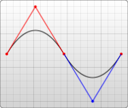
贝塞尔曲线-维基百科 中对于 5 种贝塞尔曲线有作动效展示:
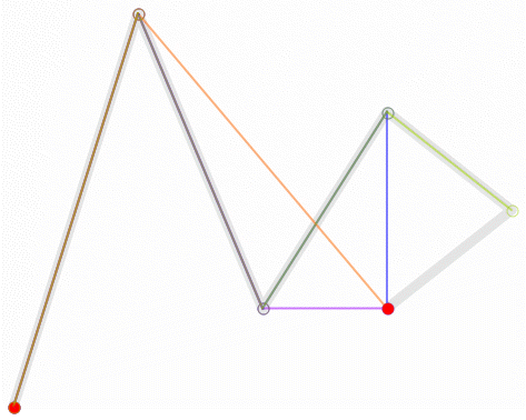
但是在 SVG 中只有二次和三次贝塞尔曲线有效,这里推荐看下张鑫旭的 深度掌握SVG路径path的贝塞尔曲线指令。
<svg width="200" height="200">

  <!-- 三次贝塞尔曲线 -->
  <path d="M 10 10 C 20 20, 40 20, 50 10" />
  <path d="M 70 10 C 70 20, 110 20, 110 10" />
  <path d="M 130 10 C 120 20, 180 20, 170 10" />
  <path d="M 10 60 C 20 80, 40 80, 50 60" />
  <path d="M 70 60 C 70 80, 110 80, 110 60" />
  <path d="M 130 60 C 120 80, 180 80, 170 60" />
  <path d="M 10 110 C 20 140, 40 140, 50 110" />
  <path d="M 70 110 C 70 140, 110 140, 110 110" />
  <path d="M 130 110 C 120 140, 180 140, 170 110" />

  <!-- 平滑三次贝塞尔曲线 -->
  <path d="M 10 80 C 40 10, 65 10, 95 80 S 150 150, 180 80" />

  <!-- 二次贝塞尔曲线 -->
  <path d="M 10 80 Q 95 10 180 80" />

  <!-- 平滑二次贝塞尔曲线 -->
  <path d="M 10 80 Q 52.5 10, 95 80 T 180 80" />
</svg>
</div>

<!--
  三次贝塞尔曲线,通过两个坐标点来控制曲线程度:
    C:x1 y1, x2 y2, x y
    x1 y1:起点控制点
    x2 y2:终点控制点
    x y:曲线终点

  平滑三次贝塞尔曲线,在三次贝塞尔上加个对称:
    S:x2 y2, x y
    x2 y2:第一个控制点(若单独使用,就是当前点;若前面有C或Q,就是前面的结尾点的中心对称点)
    x y:曲线终点

  二次贝塞尔曲线,通过两个坐标点来控制曲线程度:
    C:x1 y1, x y
    x1 y1:起点控制点
    x y:曲线终点

  平滑二次贝塞尔曲线,通过一个坐标点来控制曲线程度,和平滑三次贝塞尔曲线同理:
    T: x y
    x y:曲线终点
 -->
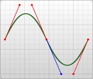
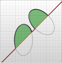
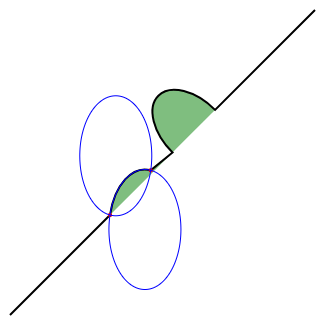
弧形曲线可以参照椭圆:
<svg width="320" height="320">

  <!-- 图1 -->
  <path
    d="M 10 315
      L 110 215
      A 30 50 0 0 1 162.55 162.45
      L 172.55 152.45
      A 30 50 -45 0 1 215.1 109.9
      L 315 10"
    stroke="black" fill="green" stroke-width="2" fill-opacity="0.5" />

  <!-- 图2 -->
    <path
      d="M 10 315
        L 110 215
        A 36 60 0 0 1 150.71 170.29
        L 172.55 152.45
        A 30 50 -45 0 1 215.1 109.9
        L 315 10"
      stroke="black" fill="green" stroke-width="2" fill-opacity="0.5" />
  <circle cx="150.71" cy="170.29" r="2" fill="red" />
  <circle cx="110" cy="215" r="2" fill="red" />
  <ellipse cx="144.931" cy="229.512" rx="36" ry="60" fill="transparent" stroke="blue" />
  <ellipse cx="115.779" cy="155.778" rx="36" ry="60" fill="transparent" stroke="blue" />
</svg>

<!--
  弧线,可参考椭圆的参数理解:
    A:rx ry x-axis-rotation large-arc-flag sweep-flag x y
    rx ry:x轴和y轴半径
    x-axis-rotation:x轴旋转角度
    large-arc-flag:角度大小
    sweep-flag:弧线方向
    x y:弧线终点
 -->
large-arc-flag 决定弧线是大于还是小于 180 度,0 表示小角度弧,1 表示大角度弧。sweep-flag 表示弧线的方向,0 表示从起点到终点沿逆时针画弧,1 表示从起点到终点沿顺时针画弧。下面是一个例子:
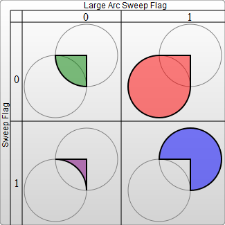
<svg width="325" height="325">
  <path
    d="M 80 80 A 45 45, 0, 0, 0, 125 125 L 125 80 Z"
    fill="green"
  />
  <path
    d="M 230 80 A 45 45, 0, 1, 0, 275 125 L 275 80 Z"
    fill="red"
  />
  <path
    d="M 80 230 A 45 45, 0, 0, 1, 125 275 L 125 230 Z"
    fill="purple"
  />
  <path d="M 230 230 A 45 45, 0, 1, 1, 275 275 L 275 230 Z"
    fill="blue"
  />
</svg>
填充
除了上面提到了 fill、stroke 和 stroke-width,还有几个其他的属性:
fill-opacity表示填充的不透明度。stroke-opacity表示边框的不透明度。stroke-linecap表示描边方式:butt|square|round。stroke-linejoin表示边框终点样式:miter|bevel|round。stroke-dasharray表示边框虚线宽度,每个数字都代表宽度(缝隙也算),然后循环。
stroke-linecap
stroke-linejoin
stroke-dasharray
<svg width="160" height="120">
  <line
    x1="80" x2="120" y1="20" y2="20" stroke="gray" stroke-width="20"
    stroke-linecap="butt"/>
  <line
    x1="80" x2="120" y1="60" y2="60" stroke="gray" stroke-width="20"
    stroke-linecap="square"/>
  <line
    x1="80"x2="120"y1="100"y2="100"stroke="gray" stroke-width="20"
    stroke-linecap="round"/>

  <polyline points="80 40 100 20 120 40" stroke="gray" stroke-width="10"
    stroke-linecap="butt" stroke-linejoin="miter"/>
  <polyline points="80 70 100 50 120 70" stroke="gray" stroke-width="10"
    stroke-linecap="round" stroke-linejoin="round"/>
  <polyline points="80 100 100 80 120 100" stroke="gray" stroke-width="10"
    stroke-linecap="square" stroke-linejoin="bevel"/>

  <path d="M80 8  L 160 8" stroke="gray" stroke-width="4"
    stroke-dasharray="5,5" />
  <path d="M80 55 L 160 55" stroke="gray" stroke-width="4"
    stroke-dasharray="10,10" />
  <path d="M80 100 L 160 100" stroke="gray" stroke-width="4"
    stroke-dasharray="20,5,10" />
</svg>
渐变
SVG 可以做到 线性渐变 和 径向渐变,不过你得用一个 id 属性让它去识别,得用一个 <defs> 标签来包裹渐变的内容,得用一个 <linearGradient> 标签来包裹线性的渐变方式,得用一个 <radialGradient> 标签来包裹径向的渐变方式。
线性渐变
<svg width="480" height="120">

  <!-- 用 defs 包裹,linearGradient 设定渐变内容 -->
  <defs>
    <linearGradient id="Gradient1" x1="0" y1="0" x2="0" y2="1">
      <stop offset="0%" stop-color="violet"/>
      <stop offset="40%" stop-color="orange" stop-opacity="0.6"/>
      <stop offset="100%" stop-color="green"/>
    </linearGradient>
    <linearGradient id="Gradient2" x1="0" y1="0" x2="1" y2="0">
      <stop offset="0%" stop-color="cyan"/>
      <stop offset="100%" stop-color="pink"/>
    </linearGradient>
  </defs>

  <rect
    x="0" y="10" rx="15" ry="15" width="100" height="100"
    fill="url(#Gradient1)"
  />
  <rect
    x="120" y="10" rx="15" ry="15" width="100" height="100"
    fill="url(#Gradient2)"
  />
</svg>

<!--
  x1 y1 x2 y2:表示水平/垂直方向的渐变,
  第一个为 x 不变,y 递进,
  第二个为 y 不变,x 递进。
 -->
径向渐变
<svg width="500" height="120">
  <defs>
    <radialGradient id="Gradient3">
      <stop offset="40%" stop-color="orange" />
      <stop offset="100%" stop-color="teal"/>
    </radialGradient>
    <radialGradient id="Gradient4" cx="0.6" cy="0.6" r="0.25">
      <stop offset="0%" stop-color="yellow"/>
      <stop offset="100%" stop-color="lightblue"/>
    </radialGradient>
    <radialGradient id="Gradient5"  cx="0.5" cy="0.5" r="0.5" fx="0.25" fy="0.25">
      <stop offset="0%" stop-color="cyan"/>
      <stop offset="100%" stop-color="pink"/>
    </radialGradient>
  </defs>
  <rect
    x="0" y="10" rx="15" ry="15" width="100" height="100"
    fill="url(#Gradient3)"
  />
  <rect
    x="200" y="10" rx="15" ry="15" width="100" height="100"
    fill="url(#Gradient4)"
  />
  <rect
    x="400" y="10" rx="15" ry="15" width="100" height="100"
    fill="url(#Gradient5)"
  />
</svg>

<!--
  fx fy:焦点,表示渐变的中心,
  cx cy r:渐变的边缘位置(圆环),r为半径
 -->
下图是径向渐变有关参数的图例:
图案
图案(Pattern) 的使用方式和渐变很类似,不过它可以重复:
<svg width="200" height="200">
  <defs>
    <linearGradient id="Gradient7">
      <stop offset="5%" stop-color="white"/>
      <stop offset="95%" stop-color="cadetblue"/>
    </linearGradient>
    <linearGradient id="Gradient8" x1="0" x2="0" y1="0" y2="1">
      <stop offset="5%" stop-color="burlywood"/>
      <stop offset="95%" stop-color="sandybrown"/>
    </linearGradient>
    <pattern id="Pattern" x="0" y="0" width=".25" height=".25">
      <rect x="0" y="0" width="50" height="50" fill="skyblue"/>
      <rect x="0" y="0" width="25" height="25" fill="url(#Gradient8)"/>
      <circle cx="25" cy="25" r="20" fill="url(#Gradient7)"/>
    </pattern>
  </defs>
  <rect fill="url(#Pattern)" x="0" y="0" width="200" height="200"/>
</svg>

<!--
  描述:一个矩形用长宽比为 25% 的 pattern 重复填充(会填充 4 次),在 pattern 里有矩形1、
  矩形2和圆,矩形2使用 Gradient8 的渐变色,圆用 Gradient7 的渐变色。
  pattern 中的 x 和 y 可以定义偏移的开始点。
 -->
文字
和普通文字类似,SVG 中的文字也有 font-family、font-size、letter-spacing 、text-decoration 等属性,它的位置通过 x 和 y 来定位:
<svg width="420" height="200">
  <text x="10" y="110" fill="orange" font-size="25">Love 💕</text>
  <text
      x="210 240 270 300 330 360 390"
      y="50 80 110 140 110 80 50"
      fill="orange"
      font-size="25"
      font-weight="bold"
    >
    evolove
  </text>
</svg>

<!--
  x y:可以是一个坐标,也可以是一个点集数列
 -->
rotate 可以旋转文字,用法分为整体旋转角度和单个文字旋转角度:
<svg width="120" height="70">
  <text x="30" y="20" fill="orange" font-size="20" rotate="20">
    e v o l o v e
  </text>
  <!--
    <text x="150" y="50" fill="orange" font-size="20" rotate="0 20 40 60 80 100">
    e v o l o v e
  </text>
   -->
</svg>
<svg width="120" height="70">
  <text x="30" y="20" fill="orange" font-size="20" rotate="20">
    e v o l o v e
  </text>
  <!--
    <text x="150" y="50" fill="orange" font-size="20" rotate="0 20 40 60 80 100">
    e v o l o v e
  </text>
   -->
</svg>
如果文字的长度和 textLength 设定的长度不一致,渲染会调整字体的位置:
<svg width="350" height="130">
  <text x="50" y="50" textLength="150" fill="orange" font-size="20">
    Hello World !
  </text>
  <text  x="50" y="100" textLength="300" fill="orange"  font-size="20">
    Hello World !
  </text>
</svg>
<svg width="350" height="130">
  <text x="50" y="50" textLength="150" fill="orange" font-size="20">
    Hello World !
  </text>
  <text  x="50" y="100" textLength="300" fill="orange"  font-size="20">
    Hello World !
  </text>
</svg>
裁剪和遮罩
裁剪主要使用 <clipPath> 标签来标记一条裁剪的路径,然后剪掉部分内容:
<svg width="300" height="300">
  <defs>
    <clipPath id="clipPath">
      <path d="M10 50 A50 50 0 0 1 100 50 A50 50 0 0 1 190 50 Q210 100 100 200  Q-5 100 10 50 Z" />
    </clipPath>
  </defs>
  <rect x="0" y="0" width="200" height="200" fill="orange" clip-path="url(#clipPath)"  />
</svg>

<!--
  描述:在一个矩形里,裁剪出一个心形
 -->
遮罩更多的表示渐变或者阴影,用 <mask> 标签表示:
<svg>
  <defs>
    <linearGradient id="Gradient10">
      <stop offset="0" stop-color="white" stop-opacity="0" />
      <stop offset="1" stop-color="white" stop-opacity="1" />
    </linearGradient>
    <mask id="Mask">
      <rect x="0" y="0" width="200" height="200" fill="url(#Gradient10)"  />
    </mask>
  </defs>
  <rect x="0" y="0" width="200" height="200" fill="orange" />
  <rect x="0" y="0" width="200" height="200" fill="cyan" mask="url(#Mask)" />
</svg>

<!--
  描述:底色是橘色,顶色是青色,过度到青色的时候用一个白色的遮罩进行过度,
  而遮罩本身用了一个渐变色。
 -->
滤镜
有关滤镜方面,推荐看下 coco 的 有意思!强大的 SVG 滤镜。
库
市面上有很多 SVG 的库,W3C 针对于 SVG 有一个 程序列表,Google Docs 绘制 也可以输出 SVG。 对于App类,W3C 支持使用 inkscape 上手绘图,当然也有很多类似于 Sketch、Adobe Illustrator 等现代工具可以绘制导出 SVG。
最后列出一点发现和 SVG 有关的 JavaScript 常见库:greensock、animejs、mojs、vivus、snapsvg、lazylinepainter、Textures.js 等。